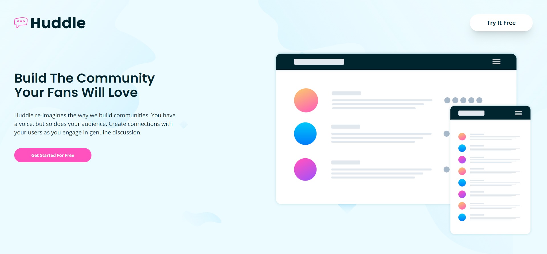
Huddle landing page
This is a solution to the Huddle landing page with alternating feature blocks challenge on Frontend Mentor challenge.
Built with
- Semantic HTML5 markup
- Mobile-first workflow
- Tailwind Css - Tailwind CLI
Process
In this project, I keep working with the Tailwind CLI. I built the whole layout with just tailwind classes. In order to use my brand colors and hero images, I customized the tailwind.config file. I completely override the font-families since I am only using custom fonts. I add colors and images on the extend object because I still wanted access to tailwinds colors.
module.exports ={
theme: {
    fontFamily: {
      body: ['Open Sans'],
      headings: ['Poppins'],
    },

    extend: {
      colors: {
        'pink': '#ff52bf',
        'paleCyan': '#ebfbff',
        'darkCyan': '#00252e',
        'grayBlue': '#6c7781',

      },
      backgroundImage: {
        'hero-desktop': "url('/images/bg-hero-desktop.svg')",
        'hero-mobile': "url('/images/bg-hero-mobile.svg')"
      }
}
This project is not just a component but a whole page, so my .index file quicly filled up with Tailwinds classes. Even thoug it is quite esasy to work with tailwind, the html code looks weird and crowded with class names.
<section
  class="shadow-[0_0_18px_1px_rgba(0,0,0,0.3)] rounded-xl py-10 text-center space-y-4 max-w-7xl mx-auto xl:grid grid-cols-2 xl:place-items-center xl:text-left"></section>
Next time I would like to use the @apply directive to add classes to the elements.
The outputed css file was 20KB. This time I took advantage of tailwind’s build-in minification and purging features. It was super easy, I just added a new script with the --minify flag like this:
"build": "npx tailwindcss -i style.css -o style.css --minify"
My final css file is only 11KB.
